

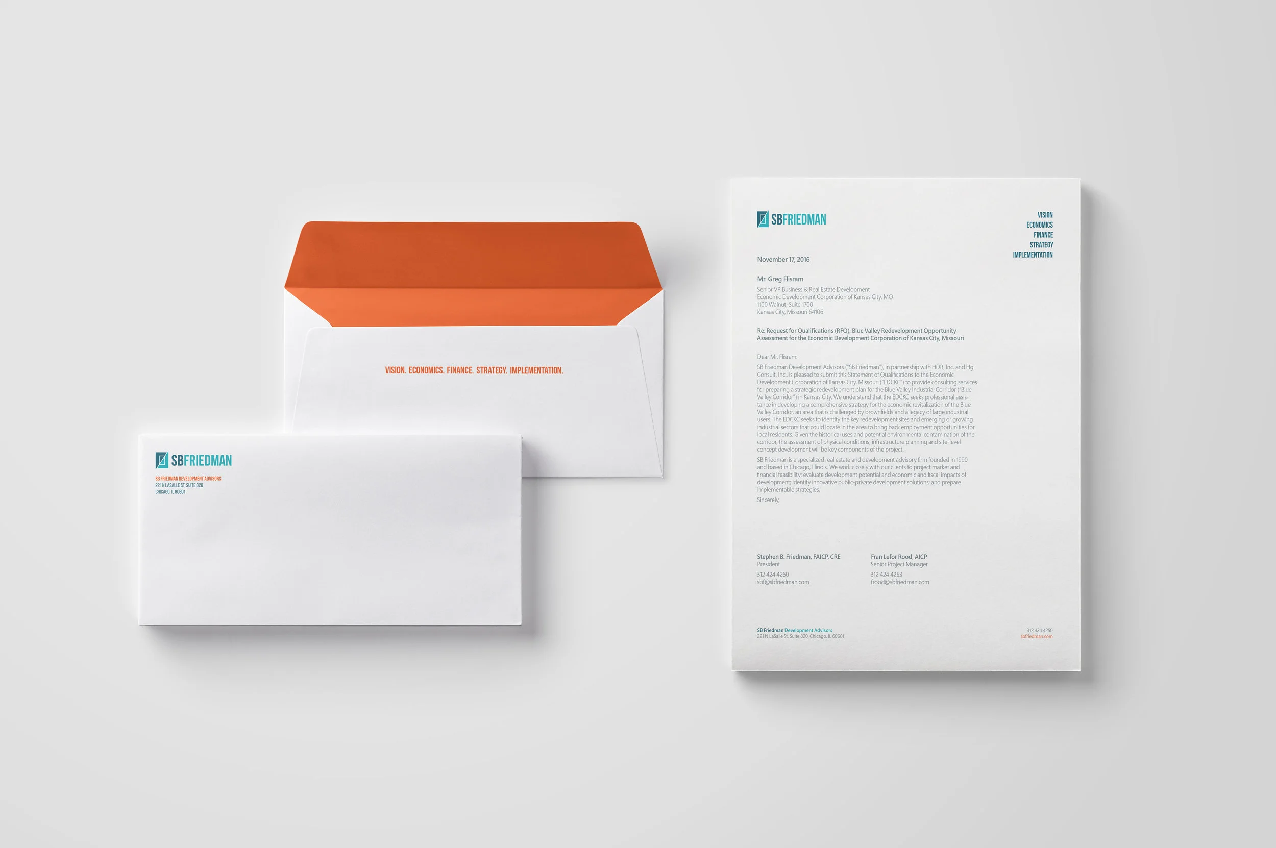


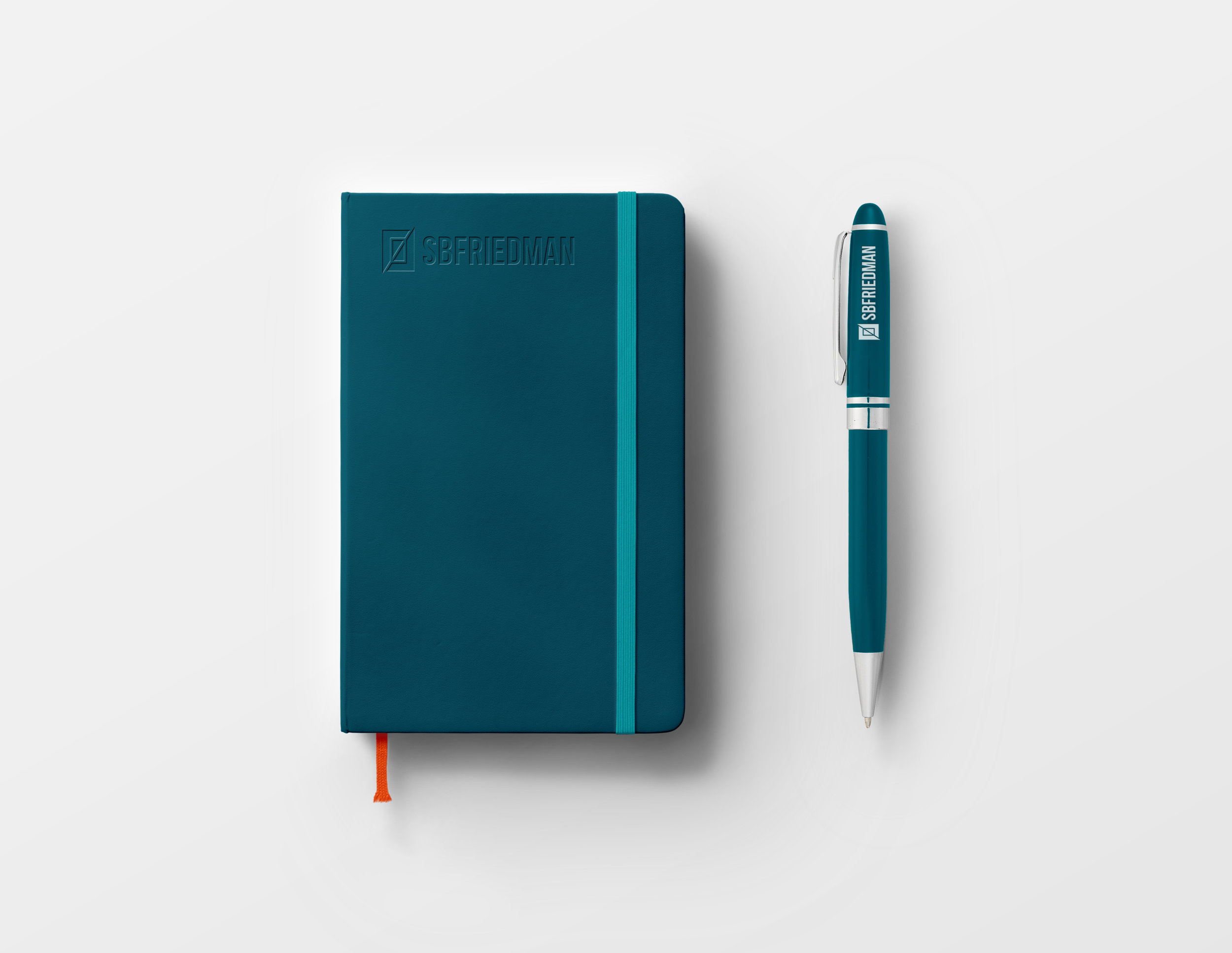


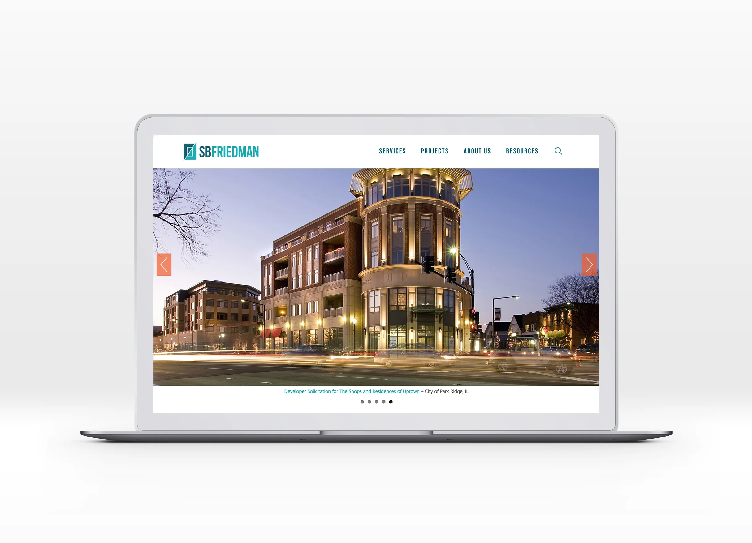

SB Friedman wished to refresh their existing brand while ensuring the new design felt like a natural evolution. The new brand is more contemporary and distinguishable in a competitive market with a fresh colour palette made up of blues and a contrasting orange to grab attention. The sharp angle of the logo icon is brought in throughout branded collateral for emphasis.
Independent work